
Friday, February 18, 2011

Double Page Spread
I've began designing the layout for my DPS and took inspiration from two examples of print media, which include 'The News' Portsmouth, and 'More' magazine. By combining design techniques from both, it'll create a youthful, finish but still contain the typical conventions of a newspaper. One page in particular:

I like how the photo is the focus and the text is separated in boxes. This also relates to my idea of incorporating an interview with a student and a member of faculty to discuss their views on teenage binge drinking. I plan to record the interview and add it to my website blog as a way of expanding on my use of technology. I've also taken ideas from a two page spread from 'The News' with regards to features. These include weather, content, smaller news reports, and contact details of the staff. I particularly liked where the weather was positioned on the page:
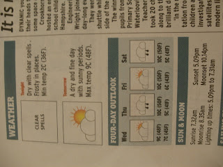
The icons I'll design on Photoshop and then add to the DPS format on InDesign.
I also want to take photos of myself and other students working on the computers in the classroom to add to a slideshow onto the website blog, to demonstrate the 'news room' working hard before the release date in May.

I like how the photo is the focus and the text is separated in boxes. This also relates to my idea of incorporating an interview with a student and a member of faculty to discuss their views on teenage binge drinking. I plan to record the interview and add it to my website blog as a way of expanding on my use of technology. I've also taken ideas from a two page spread from 'The News' with regards to features. These include weather, content, smaller news reports, and contact details of the staff. I particularly liked where the weather was positioned on the page:

The icons I'll design on Photoshop and then add to the DPS format on InDesign.
I also want to take photos of myself and other students working on the computers in the classroom to add to a slideshow onto the website blog, to demonstrate the 'news room' working hard before the release date in May.
Friday, February 11, 2011
Finishing Touches
After inserting the main advertisement to the front cover, I began lining up the graphics to order to make the design symmetrical. I used the InDesign page margins and columns to ensure they're in perfect alignment:

After looking at the final print out version, I found the text looked too large on paper in comparison to the headlines and images. I then decided to use font size 11 instead of 13:

Finally I began uploading images onto photo bucket to then insert them onto my website. These images include the advertisements:


After looking at the final print out version, I found the text looked too large on paper in comparison to the headlines and images. I then decided to use font size 11 instead of 13:

Finally I began uploading images onto photo bucket to then insert them onto my website. These images include the advertisements:

Friday, January 28, 2011
Festival Advert
I drew up a basic image for the initial advert, including the name of the festival (RUDE BOX 2011) and a slogan, dirt, dance and dupstep. This then appeals to the target audience of young adults and teenagers as it's a youthful, fun and appealing experience. I then scanned the image onto photoshop:


I finally added the finished advert to my newspaper design:

I especially like how it stands out on the page in contrast to the lighter shades. This then attracts potential buyers to this particular newspaper in comparison to others around.


I then added a new layer, and began filling in the gaps with colour and text:


I especially like how it stands out on the page in contrast to the lighter shades. This then attracts potential buyers to this particular newspaper in comparison to others around.
Friday, January 21, 2011
Editor's photo
I've now uploaded my profile image to my blog on the website to add a more realistic tone to my newspaper:
Today I plan to begin designing the advertisements for my cover as well as one's to put onto the website. I was inspired by Kate Moross:

This looks youthful and artistic, which I want to use as a basis for my festival ticket competition. I'll begin by drawing the graphics by pencil, scanning the image onto the computer, then using photoshop I'll color in the picture to give a similar effect.
 |

This looks youthful and artistic, which I want to use as a basis for my festival ticket competition. I'll begin by drawing the graphics by pencil, scanning the image onto the computer, then using photoshop I'll color in the picture to give a similar effect.
Friday, January 14, 2011
Production Lesson 8
Today I decided to work on both my website and print design. I've decided my two pages on www.expressnews4u.co.uk will be the home page and the editor's blog. I've incorporated current affairs within the news and also advertised the release date for the first issue of the paper:


I also asked for the readers to interact with the site and this included asking students in class to comment.
One comment to develop my blog would be to add a photo of myself to accentuate the fact I'm the Editor and it also adds a sense of familiarity for a reader to see a face to associate with.
For my print design I've finished the overall layout and am now beginning to consider potential advert designs:


I also asked for the readers to interact with the site and this included asking students in class to comment.
One comment to develop my blog would be to add a photo of myself to accentuate the fact I'm the Editor and it also adds a sense of familiarity for a reader to see a face to associate with.
For my print design I've finished the overall layout and am now beginning to consider potential advert designs:

Friday, January 7, 2011
Production lesson 7
Today I began taking photographs for my main cover story about teenage binge drinking. I decided to use an image of a young girl seemingly drunk with a wine bottle in her hand. This coincides with a point I make in the article itself:

I used photoshop to make the image more visually dynamic with regards to colour adjustments and light levels:


I used photoshop to make the image more visually dynamic with regards to colour adjustments and light levels:

Other photo's I'd taken I felt were too posed or looked distorted from the weather conditions of quality of capture:


After adding the image onto my newspaper design, I began experimenting with the layout:

Subscribe to:
Posts (Atom)