I've began designing the layout for my DPS and took inspiration from two examples of print media, which include 'The News' Portsmouth, and 'More' magazine. By combining design techniques from both, it'll create a youthful, finish but still contain the typical conventions of a newspaper. One page in particular:
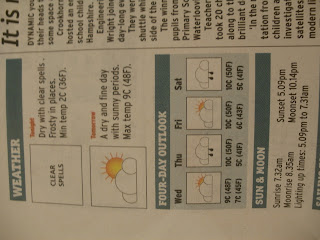
I like how the photo is the focus and the text is separated in boxes. This also relates to my idea of incorporating an interview with a student and a member of faculty to discuss their views on teenage binge drinking. I plan to record the interview and add it to my website blog as a way of expanding on my use of technology. I've also taken ideas from a two page spread from 'The News' with regards to features. These include weather, content, smaller news reports, and contact details of the staff. I particularly liked where the weather was positioned on the page:
The icons I'll design on Photoshop and then add to the DPS format on InDesign.
I also want to take photos of myself and other students working on the computers in the classroom to add to a slideshow onto the website blog, to demonstrate the 'news room' working hard before the release date in May.


No comments:
Post a Comment